


Comparing box plots


Lesson details
Learning outcome
I can interpret a box plot and compare two box plots.
Key learning points
- A box plot allows us to make conclusions about the data set
- Box plots can be compared to highlight similarities/differences in data sets
- The box part tells us about the middle 50% of the data
Keywords
Box plot - A box plot is a diagram that clearly shows the minimum and maximum value of a data set along with the three quartiles.
Median - The median is the central (middle) piece of data when the data are in numerical order. It is a measure of central tendency representing the average of the values.
Range - The range is a measure of spread. It is found by finding the difference between the highest and lowest values.
Common misconception
Not referring to the context of the question when comparing the data.
Highlight that just saying the median or the middle 50% of data is bigger is of little use unless you know what the data was about. Check that pupils understand the context of the question.
Teacher tip
Collect data from the class, split into groups and compare the data by drawing box plots. For example, pupils could collect data on how many seconds they can hold their breath for. Alternatively, this is an opportunity to use data from other subjects, such as Geography or Science.

Licence

Lesson video
Loading...
Prior knowledge starter quiz
6 Questions
Q1.The vertical line inside the box of a box plot represents the .

Q2.What is the height of the tallest person?

Q3.What is the lower quartile height?
Q4.What is the upper quartile of this set of data? 17, 13, 19, 21, 13, 14.
Q5.Below is the box plot for this set of data: 17, 13, 19, 21, 13, 14. What is the value of point A on the box plot?
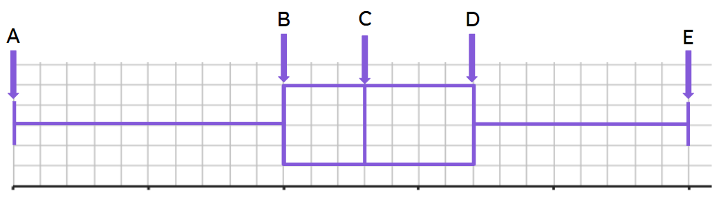
Q6.Below is the box plot for this set of data: 17, 13, 19, 21, 13, 14. What is the value of point D on the box plot?
Assessment exit quiz
6 Questions
Q1.Anything below the __________ represents 25% of the data.
Q2.Anything below the upper quartile represents what percentage of the data?
Q3.What is the range of the middle 50% of data?
Q4.A box indicates data that is more consistent.
Q5.Which class did better on average?
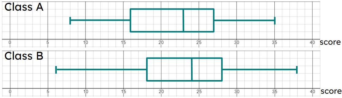
Q6.Which class has more consistent scores?
To help you plan your 11 maths lesson on: Comparing box plots, download all teaching resources for free and adapt to suit your pupils' needs...
To help you plan your 11 maths lesson on: Comparing box plots, download all teaching resources for free and adapt to suit your pupils' needs.
The starter quiz will activate and check your pupils' prior knowledge, with versions available both with and without answers in PDF format.
We use learning cycles to break down learning into key concepts or ideas linked to the learning outcome. Each learning cycle features explanations with checks for understanding and practice tasks with feedback. All of this is found in our slide decks, ready for you to download and edit. The practice tasks are also available as printable worksheets and some lessons have additional materials with extra material you might need for teaching the lesson.
The assessment exit quiz will test your pupils' understanding of the key learning points.
Our video is a tool for planning, showing how other teachers might teach the lesson, offering helpful tips, modelled explanations and inspiration for your own delivery in the classroom. Plus, you can set it as homework or revision for pupils and keep their learning on track by sharing an online pupil version of this lesson.
Explore more key stage 4 maths lessons from the Graphical representations of data: cumulative frequency and histograms unit, dive into the full secondary maths curriculum, or learn more about lesson planning.