Myths about teaching can hold you back


- Year 11•
- Higher
Problem solving with cumulative frequency and histograms
I can use my knowledge of cumulative frequency and histograms to solve problems.


- Year 11•
- Higher
Problem solving with cumulative frequency and histograms
I can use my knowledge of cumulative frequency and histograms to solve problems.
Lesson details
Key learning points
- Different representations of the same data set give a fuller picture
- It is important to identify what features are used to analyse a data set
- It is important to identify what features are used to compare two data sets
Keywords
Box plot - A box plot is a diagram that clearly shows the minimum and maximum value of a data set long with the three quartiles.
Lower quartile - The lower quartile is the value under which 25% of data points are found when they are arranged in increasing order. Also known as the first quartile (Q1).
Upper quartile - The upper quartile is the value under which 75% of data points are found when they are arranged in increasing order. Also known as the third quartile (Q3).
Histogram - A histogram is a diagram consisting of rectangles whose area is proportional to the frequency in each class and whose width is equal to the class interval.
Common misconception
Histograms with unequal bar widths are plotted against the frequency and/or pupils read the frequency density as the frequency of the class width.
Show what a histogram with unequal bar widths looks like when plotted against frequency. This visual aid will show pupils the distribution of data is difficult to see.
To help you plan your year 11 maths lesson on: Problem solving with cumulative frequency and histograms, download all teaching resources for free and adapt to suit your pupils' needs...
To help you plan your year 11 maths lesson on: Problem solving with cumulative frequency and histograms, download all teaching resources for free and adapt to suit your pupils' needs.
The starter quiz will activate and check your pupils' prior knowledge, with versions available both with and without answers in PDF format.
We use learning cycles to break down learning into key concepts or ideas linked to the learning outcome. Each learning cycle features explanations with checks for understanding and practice tasks with feedback. All of this is found in our slide decks, ready for you to download and edit. The practice tasks are also available as printable worksheets and some lessons have additional materials with extra material you might need for teaching the lesson.
The assessment exit quiz will test your pupils' understanding of the key learning points.
Our video is a tool for planning, showing how other teachers might teach the lesson, offering helpful tips, modelled explanations and inspiration for your own delivery in the classroom. Plus, you can set it as homework or revision for pupils and keep their learning on track by sharing an online pupil version of this lesson.
Explore more key stage 4 maths lessons from the Graphical representations of data: cumulative frequency and histograms unit, dive into the full secondary maths curriculum, or learn more about lesson planning.

Licence
Lesson video
Loading...
Prior knowledge starter quiz
6 Questions
Q1.Which of the following is true for a histogram with unequal bar widths?
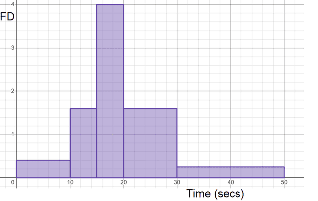
Q2.Here are the times taken to type the alphabet. Match the class width with its frequency.

$$0 < t \leq 10$$ -
Frequency = 4
$$10 < t \leq 15$$ -
Frequency = 8
$$15 < t \leq 20$$ -
Frequency = 20
$$20 < t \leq 30$$ -
Frequency = 16
$$30 < t\leq 50$$ -
Frequency = 5
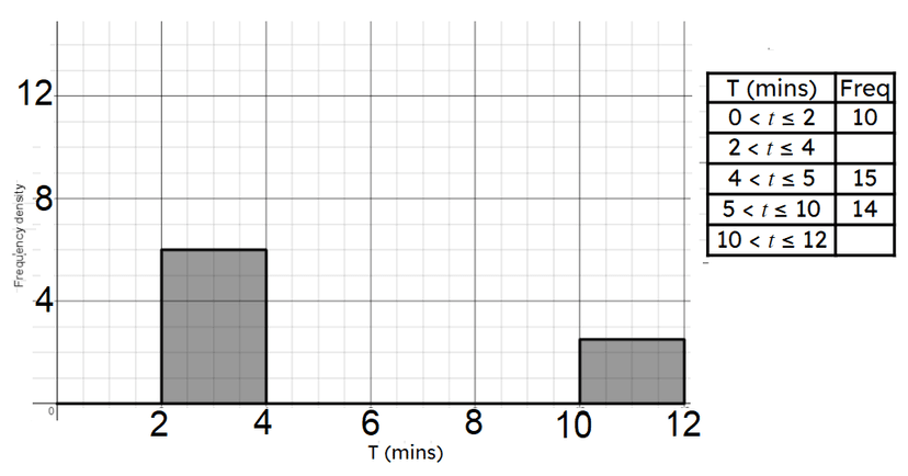
Q3.Here is a histogram showing the time it takes to solve a puzzle. Match the class width with its frequency.

$$0 < t\leq 2$$ -
10
$$2 < t \leq 4$$ -
12
$$4 < t \leq 5$$ -
15
$$5 < t\leq 10$$ -
14
$$10 < t \leq 12$$ -
5
Q4.Which class' scores were more consistent?

Q5.Calculate the interquartile range from this cumulative frequency graph.

Q6.This table show information about the times taken by some children and adults to complete a puzzle. Compare their times. Which is the correct response to this question?

Assessment exit quiz
6 Questions
Q1.Match the statement with the definition.
A boxplot -
a diagram that clearly shows the min and max values and the quartiles
A histogram -
a diagram with rectangles whose area is proportional to the frequency
Lower quartile -
the value under which 25% of data points are found
Upper quartile -
the value under which 75% of data points are foun
Q2.Here are some test scores for Class A and Class B. Select the statement which is true.

Q3.Here are two box plots showing the scores of two classes. Select the statements which are true.

Q4.Here are three different cumulative frequency graphs showing different classes' test percentages. The scale is unlabelled but is the same for all graphs. Which class has the lowest average score

Q5.Here are three box plots showing different classes' test percentages. The scale is unlabelled but is the same for all graphs.

Class C -
has the most consistent scores as the IQR and range is the smallest
Class B -
is on average the lowest performing class
Class A and B -
have the same IQR and range
Class A and C -
have on average the higher performing students
Q6.Here are some masses of sweets in a bag. 50% of the sweets are ≤ 120 g but greater than 80 g. What percentage are greater than 120 g but less than or equal to 180 g?
