


Seed dispersal: data analysis


Lesson details
Learning outcome
I can display data as a graph or chart and identify patterns to conclude on the relationship between the independent and dependent variable.
Key learning points
- Experimental data can be analysed by plotting data on a line graph or bar chart.
- Line graphs are used where the independent variable is continuous; bar charts are used where it is categoric.
- Drawing a bar chart and/or line graph follows a set format.
- A line of best fit on a line graph indicates the trend (relationship between in the independent and dependent variable).
Keywords
Line graph - A line graph displays data where the independent and dependent variables are continuous.
Bar chart - A bar chart displays data where the independent variable is categoric.
Line of best fit - A smooth line on a line graph that indicates the trend in the data is called the line of best fit.
Trend - A trend is a pattern in the data that shows the relationship between the independent and dependent variable.
Common misconception
Labelling the x-axis with the values investigated instead of an evenly spaced range; or putting the axes the wrong way round for independent and dependent variables.
Clearly showing the placement of variables in the table and on the graphs, step-by-step guidance of drawing the graphs.
Teacher tip
Work through the graph drawing slowly, getting pupils to do one step at a time.

Licence

Lesson video
Loading...
Prior knowledge starter quiz
6 Questions
Q1.Match the variable to its description.

Q2.In the following investigation what is the dependent variable?
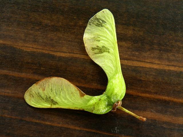
How wing shape affects the distance seeds disperse.
Q3.In an investigation what do you use to collect your result in?
Q4.In this investigation what is the independent variable?
How distance from a light source effects the number of seed germinating.
Q5.When you collect repeat readings you can calculate a
Q6.What is an anomalous result?
Assessment exit quiz
6 Questions
Q1.Match the type of graph or chart to its use.
Q2.Put the following steps in order.
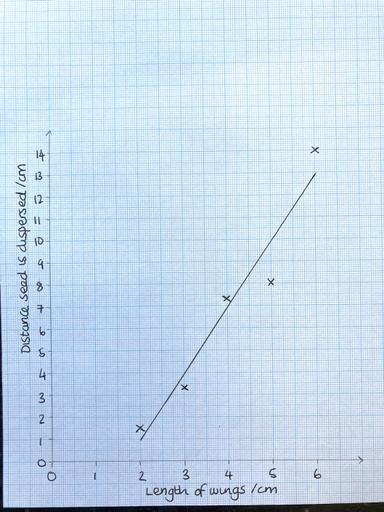
Q3.What does this data show?
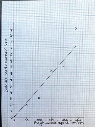
Q4.Match the variable to the axis it is plotted on.
Q5.What is the dependent variable on this bar chart?
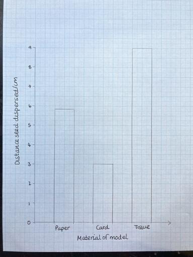
Q6.Which conclusions can be drawn form this bar chart?
To help you plan your 9 science lesson on: Seed dispersal: data analysis, download all teaching resources for free and adapt to suit your pupils' needs...
To help you plan your 9 science lesson on: Seed dispersal: data analysis, download all teaching resources for free and adapt to suit your pupils' needs.
The starter quiz will activate and check your pupils' prior knowledge, with versions available both with and without answers in PDF format.
We use learning cycles to break down learning into key concepts or ideas linked to the learning outcome. Each learning cycle features explanations with checks for understanding and practice tasks with feedback. All of this is found in our slide decks, ready for you to download and edit. The practice tasks are also available as printable worksheets and some lessons have additional materials with extra material you might need for teaching the lesson.
The assessment exit quiz will test your pupils' understanding of the key learning points.
Our video is a tool for planning, showing how other teachers might teach the lesson, offering helpful tips, modelled explanations and inspiration for your own delivery in the classroom. Plus, you can set it as homework or revision for pupils and keep their learning on track by sharing an online pupil version of this lesson.
Explore more key stage 3 science lessons from the Reproduction in plants unit, dive into the full secondary science curriculum, or learn more about lesson planning.