


Discontinuous variation: data handling and analysis


Lesson details
Learning outcome
I can plot data on discontinuous variation on a bar chart and suggest possible causes for the variation.
Key learning points
- Using a bar chart to display discontinuous data.
- Plotting data for discontinuous variation on a bar chart.
- Interpreting and describing a bar chart displaying data for discontinuous variation.
- Discontinuous variation usually has only a genetic cause and is not affected by environment or lifestyle.
Keywords
Discontinuous variation - Variation which is categorical (divided into particular categories).
Bar chart - A graph displaying categorical data plotted as columns of equal width that do not touch. The height of each column represents the tally or frequency for the category (how many times it was observed).
Genetics - Related to the genetic material (DNA) and genes that an individual has.
Common misconception
Using a line graph or histogram to plot discontinuous data. All features show variation due to environmental and lifestyle factors.
The lesson explores why a bar chart is the correct choice for plotting discontinuous data, and the idea that discontinuous variation usually has only a genetic cause.
Teacher tip
Students should plot a bar chart of their own data that they collected in the previous lesson if possible. Alternatively, sample data is provided for plotting.

Licence

Lesson video
Loading...
Prior knowledge starter quiz
6 Questions
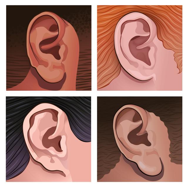
Q1.In the image, which earlobes are attached?

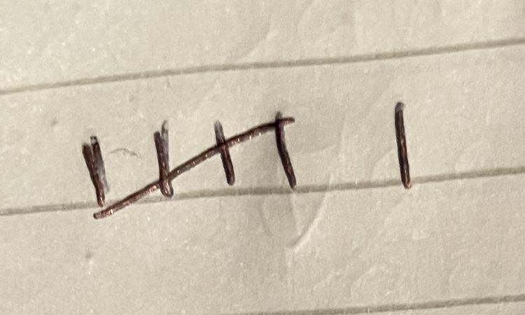
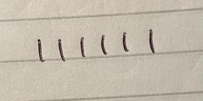
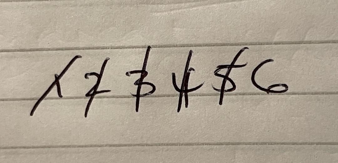
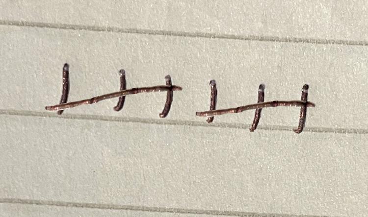
Q2.Which tally is correct for six items?
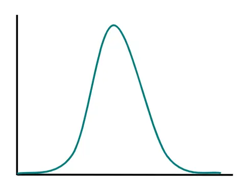
Q3.Which type of graph is this?
Q4.On which axis of a graph should you plot the independent variable?
Q5.On which axis of a graph should you plot the dependent variable?
Q6.Why is it often valuable to plot data as a graph?
Assessment exit quiz
6 Questions
Q1.Blood type and earlobe attachment are examples of variation.
Q2.Which type of graph is this?
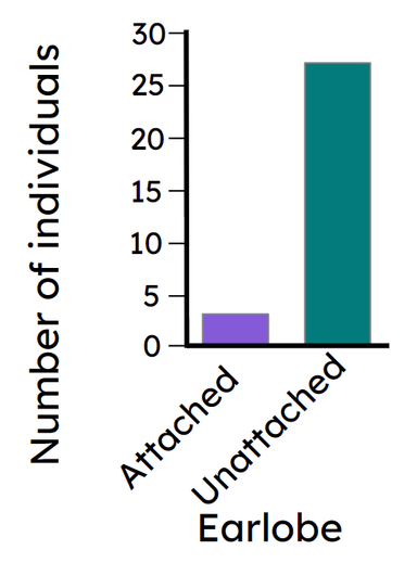
Q3.How should a bar chart be plotted?
Q4.Which of these factors causes discontinuous variation between organisms?
Q5.Which statements about the bar chart are true?
Q6.Eye colour is genetic, but there many variations of colours. How many genes must control this feature?
To help you plan your 8 science lesson on: Discontinuous variation: data handling and analysis, download all teaching resources for free and adapt to suit your pupils' needs...
To help you plan your 8 science lesson on: Discontinuous variation: data handling and analysis, download all teaching resources for free and adapt to suit your pupils' needs.
The starter quiz will activate and check your pupils' prior knowledge, with versions available both with and without answers in PDF format.
We use learning cycles to break down learning into key concepts or ideas linked to the learning outcome. Each learning cycle features explanations with checks for understanding and practice tasks with feedback. All of this is found in our slide decks, ready for you to download and edit. The practice tasks are also available as printable worksheets and some lessons have additional materials with extra material you might need for teaching the lesson.
The assessment exit quiz will test your pupils' understanding of the key learning points.
Our video is a tool for planning, showing how other teachers might teach the lesson, offering helpful tips, modelled explanations and inspiration for your own delivery in the classroom. Plus, you can set it as homework or revision for pupils and keep their learning on track by sharing an online pupil version of this lesson.
Explore more key stage 3 science lessons from the Variation (differences within species) unit, dive into the full secondary science curriculum, or learn more about lesson planning.