


Constructing bar charts by utilising technology


Lesson details
Learning outcome
I can construct bar charts from data using technology.
Key learning points
- Bar charts can be constructed quickly using spreadsheets.
- Bar charts can be constructed quickly using Desmos.
- A template file can be used to make bar chart creation quick and easy.
Keywords
Frequency - The frequency is the number of times an event occurs; or the number of individuals (people, animals etc.) with some specific property.
Bar chart - A bar chart (bar graph) is a graph consisting of bars visually representing the frequency of objects or groups.
Data - Data are a collection of information.
Common misconception
Pupils may select additional cells which will cause their chart to look strange.
They can edit the data selected or delete the chart and start again.
Teacher tip
You may wish to set up your own data file to allow pupils to investigate all the formatting tools available.

Licence

Lesson video
Loading...
Prior knowledge starter quiz
6 Questions
Q1.A is a graph consisting of bars visually representing the frequency of objects or groups.

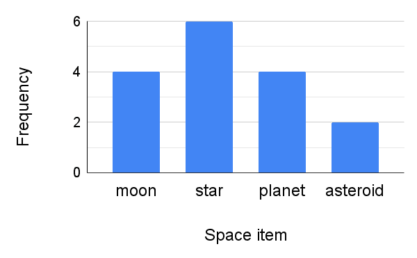
Q2.What is the frequency of 'planet' according to this bar chart?
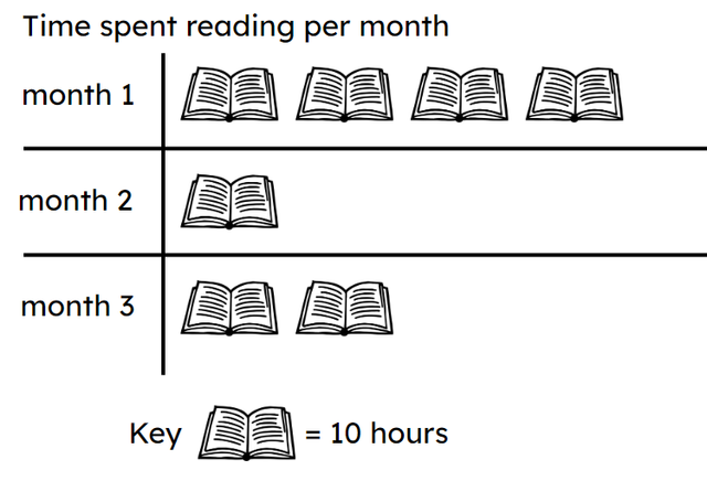
Q3.Starting with the least amount of time spent reading put the months in order from least to greatest.
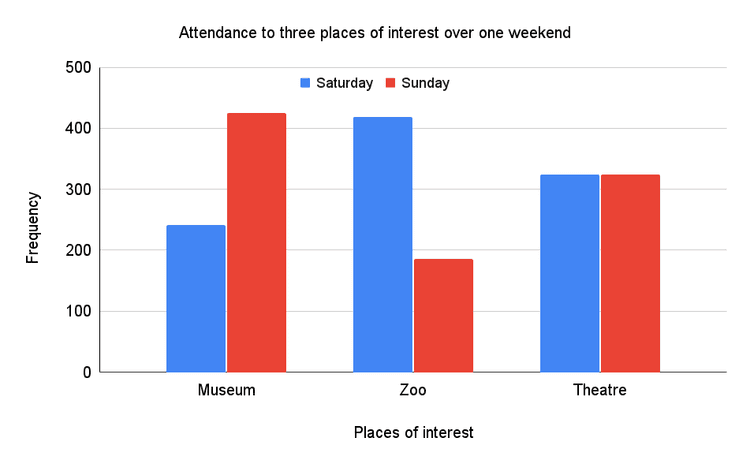
Q4.The had the same amount of visitors on both Saturday and Sunday.
Q5.Which charts represent this data?
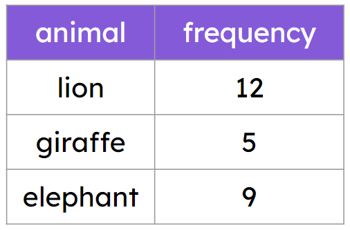
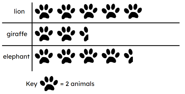
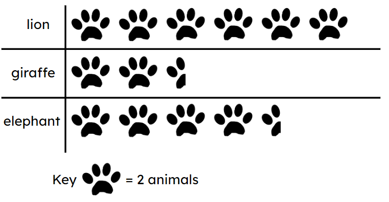
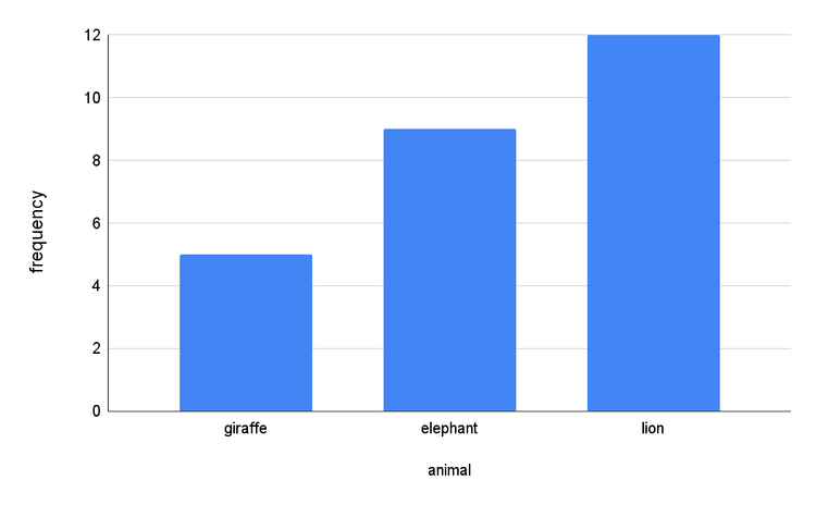
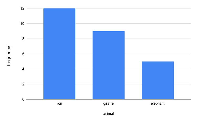
Q6.Frequency is always found on the vertical axis of a bar chart. True or false?
Assessment exit quiz
6 Questions
Q1.A file is used to support the creation of multiple charts with similar formatting and style.
Q2.Microsoft Excel and Google Sheets are two examples of software.
Q3.Put the steps for chart creation in order.
Q4.The frequency scale is auto generated by the software. Can it be changed?
Q5.When data has been copied into the spreadsheet software, each piece of data needs to be in its own cell and the list needs to be .
Q6.Where can you find the 'insert charts' button in Google Sheets or Microsoft Excel?
To help you plan your 8 maths lesson on: Constructing bar charts by utilising technology, download all teaching resources for free and adapt to suit your pupils' needs...
To help you plan your 8 maths lesson on: Constructing bar charts by utilising technology, download all teaching resources for free and adapt to suit your pupils' needs.
The starter quiz will activate and check your pupils' prior knowledge, with versions available both with and without answers in PDF format.
We use learning cycles to break down learning into key concepts or ideas linked to the learning outcome. Each learning cycle features explanations with checks for understanding and practice tasks with feedback. All of this is found in our slide decks, ready for you to download and edit. The practice tasks are also available as printable worksheets and some lessons have additional materials with extra material you might need for teaching the lesson.
The assessment exit quiz will test your pupils' understanding of the key learning points.
Our video is a tool for planning, showing how other teachers might teach the lesson, offering helpful tips, modelled explanations and inspiration for your own delivery in the classroom. Plus, you can set it as homework or revision for pupils and keep their learning on track by sharing an online pupil version of this lesson.
Explore more key stage 3 maths lessons from the Graphical representations of data unit, dive into the full secondary maths curriculum, or learn more about lesson planning.